Good typography helps to attract consumers’ attention and convey product information. 👀
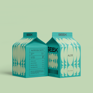
Designed by Nazar Kabanov, Seek Juice looks modern and stylish thanks to its dynamic typography.
The packaging’s eye-catching color palette and clean shapes are inspired by the fruits of their corresponding flavors. The bold typography adds an additional structured element to create a vibrant look. 🧃
We think the creative typography of this juice packaging establishes a strong visual hierarchy and makes it stands out on the shelf! 💚
Read more: https://buff.ly/3zXbXhB
