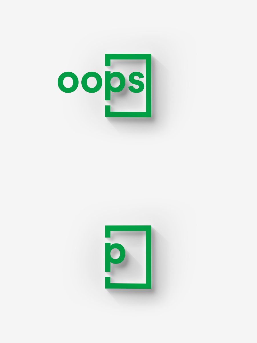
We all know the feeling. You click on a link to an article that you want to read, and what! 404. Page not found. It leaves you feeling frustrated and often confused about what to do next. But what if the error you landed on was engaging? Delightful, even? Could that negative experience be turned into a positive one?
A 404 error landing page is one no one wants to land on. But a small percentage of users will find themselves there regardless. It is crucial to see this as an opportunity to express your brand identity with an added touch of creativity. If done well, you can even turn this into a sales opportunity.
What is a 404 page?
In simple terms, a 404 error tells you a page does not exist. It is a page to communicate an error in locating the page you were looking for.
It is important to note that this is not always your fault. The causes for a 404 page can be a mistyped word in the URL by the user, misspelled backlinks, or removed pages causing broken links.
A 404 page should do two main things:
- It tells the visitor that they were successful in communicating with the web server, but the web server could not find the requested page.
- It prompts the visitor to go back to the working part of your website.
The job of a 404 page is to nudge a visitor in the right direction so they can carry on with their journey without any worry.
What a 404 page says about you?
Developing an interesting and user-friendly 404 page shows you care about every user on your site, even the ones who got lost along the way. It gives the opportunity to create a great impression of your site and of you as a brand.
Error pages should reassure, delight, and guide the user to interesting content. Taking the time to design an engaging, memorable 404 page is a worthwhile investment.
What should a 404 page include?
Your page content will be determined by your brand identity. However, it is important to include these must-have elements when designing and prototyping a 404 error page.
A clear error message
You do not want to further frustrate a potentially disgruntled user. So keep it short and simple. You need your user to recognize immediately that they’ve landed on an error page. To minimize the user’s confusion and frustration, it is best practice is to provide a simple explanation of why this might have occurred.
Avoid using technical jargon. Rather use simple terminology like:
“The link you clicked on is broken.”
“The page you’re looking for doesn’t exist.”
“We couldn’t find the page you were looking for.”
In addition, limit the character count as you don’t specifically want the content on this page to be crawled by Google.
Brand look and feel
Make sure your 404 page matches the look and feel of your site. For many users, a 404 page might be the very first interaction they have with a brand. That’s a lot of pressure for one little error page. Follow basic best practices such as ensuring that the aesthetics of the page fit with the rest of the site. Make sure the tone is on-brand throughout, and that icons and visuals are coherent with your brand architecture.
A light touch
Try to turn an average user experience into something they remember – in a good way! Do something unique, lighthearted, and interactive if you can. It might turn a frustrated user into a happy one. There are numerous ways to add a light touch to your 404. Canva 404 design tips provide different design strategies in detail.
Call to action
The best practice is to design a 404 page with a handful of key links. Including a link to the Home page as an easy get-out for users who’re not sure what they’re looking for yet. Adding a search box linking to your site is also an effective way to ensure this is not a lost opportunity, as it gives users back a sense of control over their experience.
Great examples of 404 pages
1. Mailchimp
We love Mailchimp‘s 404 page. It mirrors the feel of the brand perfectly. It includes a fun illustration as well as a quirky take on why you are here and gives a brief explanation of how they couldn’t find the page the user was looking for.

2. Figma
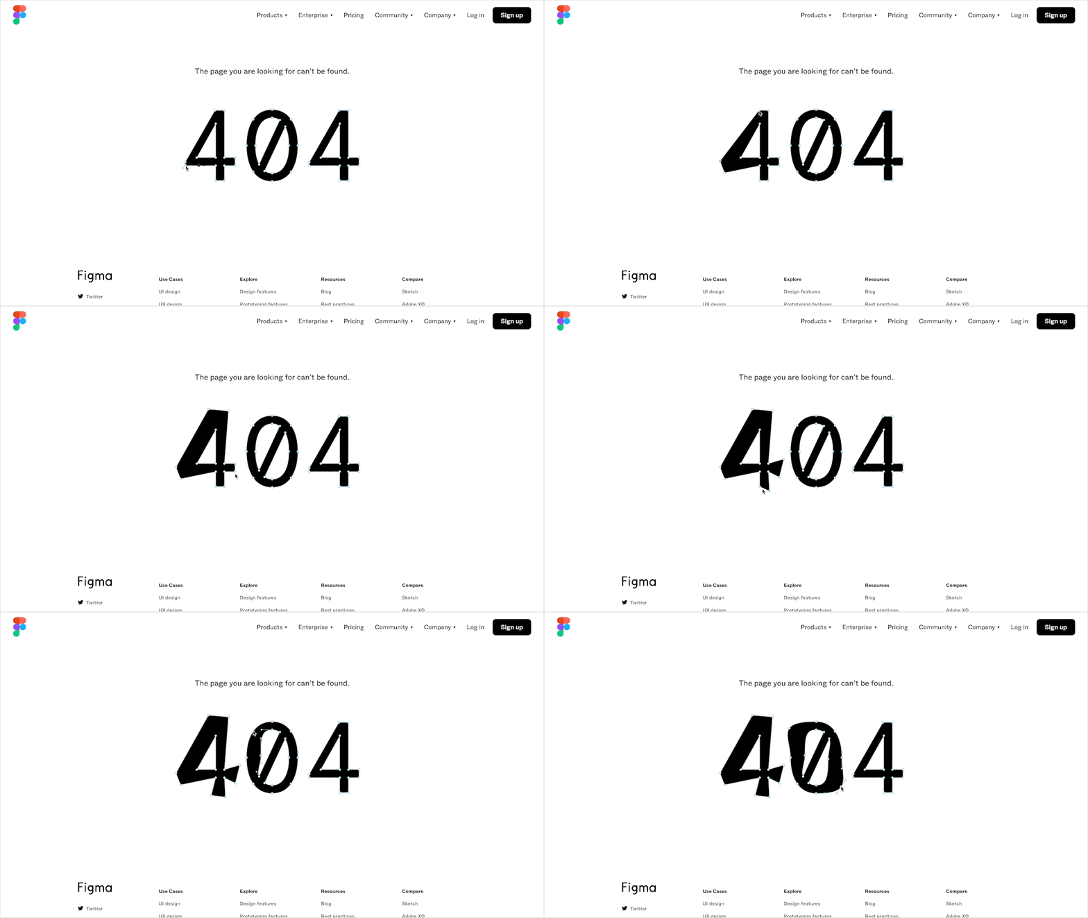
We think Figma‘s error page is on point. Clean and simple, with plenty of options for users to continue navigating. The highlight of the page though is the oversized 404 text rendered in vectors that you can reshape to your heart’s content.
3. Slack
The attention to detail Slack has put into their error page is delightful. If you were to stumble across a 404 error in Slack, you’ll be greeted by a lush, calm grassy field. Presumably designed to offset the frustration of encountering a hiccup. In actual fact, this error page recreates illustrations from a level of the game Glitch. In Glitch, the players are focused on collaborative exploration, collection, and building tasks. Find out the story behind Glitch.

4. The New Yorker
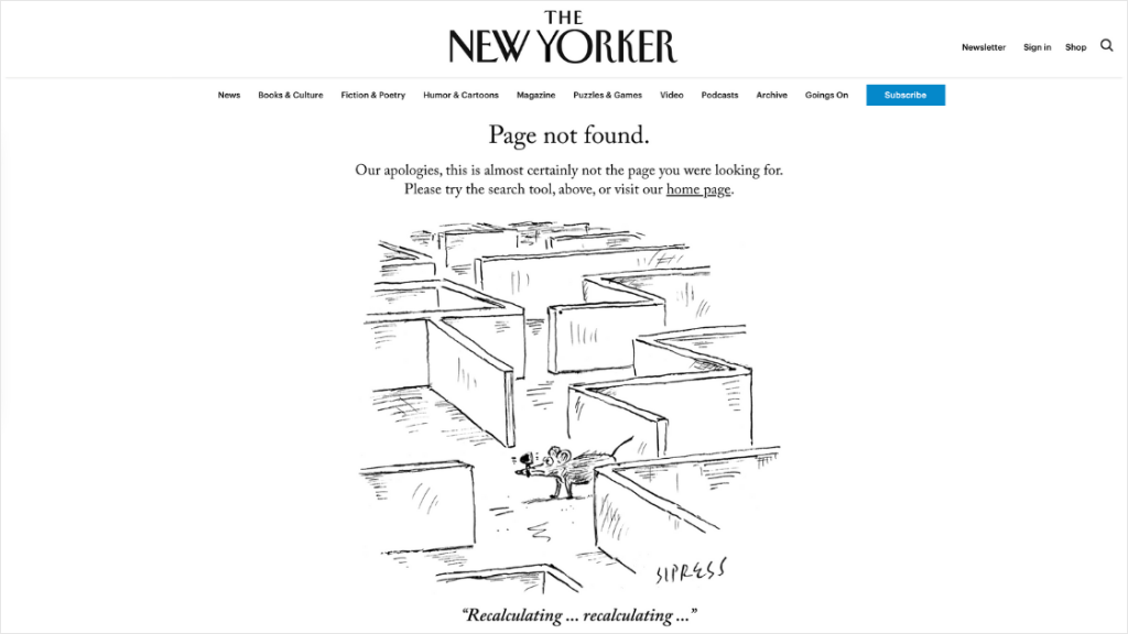
The New Yorker is famous for its cartoons, as well as outstanding journalism and other written copy. So, using a cartoon by one of their artists hits the perfect tone for their 404 page. It is a perfect fit with their brand personality and the rest of the website. Its message is clear – apologizing for their error they direct people to navigate to their homepage and has a search bar as well.
5. Hubspot
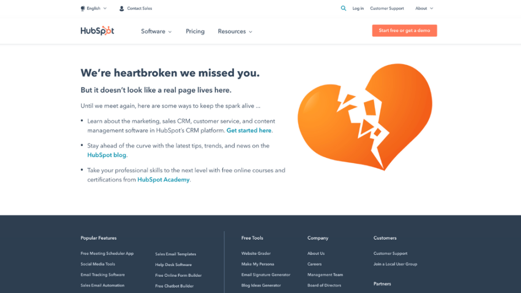
Hubspot uses a simple graphic of a broken heart for their 404 page. We love this, as it is a perfect fit with their brand voice. Hubspot considers “clever site copy” to be a love language. The graphic clearly shows the pain of a missed contact. They also ensure their 404 page is as helpful as possible with numerous redirects links and search box.
6. Pound & Grain
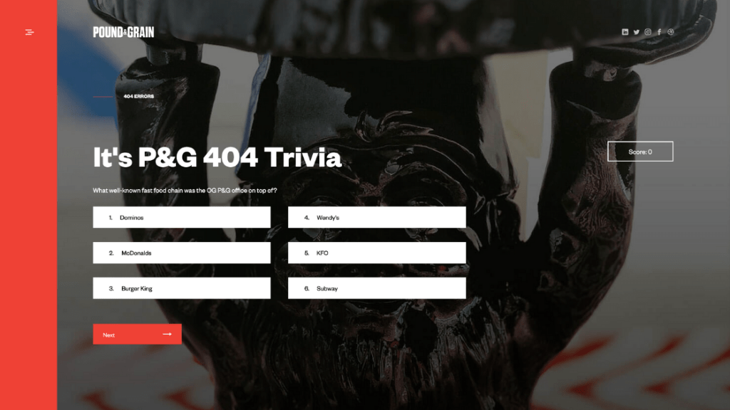
We think the 404 page of the Canadian digital marketing agency, Pound & Grain, is a great example of turning a negative experience into a fun and smart one.
The page allows visitors to learn more about the agency’s history as well as previous projects with a short and entertaining quiz, named P&G Trivia.
7. InVision
InVision is a classic example of a great 404 page that uses a simple illustration to deliver a great experience. We love that the illustration communicates broken so clearly and the fact the page includes 4 navigation buttons including a “contact us” to make users feel supported in their search to get back on track.

8. Spotify
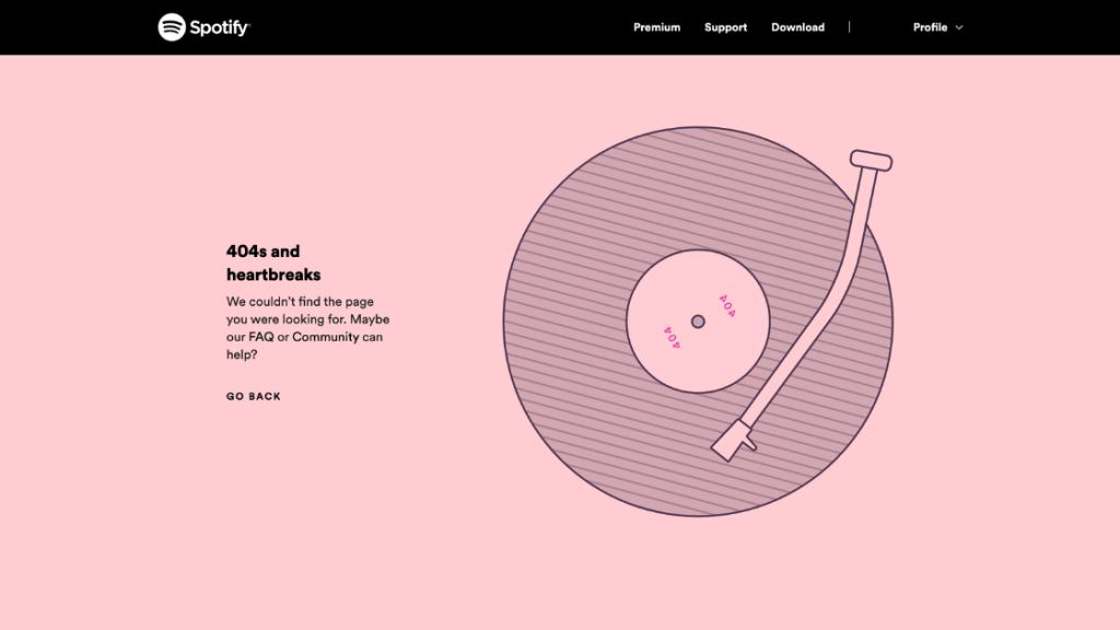
Spotify‘s 404 page is a direct reflection of their brand with a simple illustration that would appeal to their target market. A perfect balance of branding and design of key features. Take a closer look at the name of the spinning record.
9. Adobe
Adobe’s 404 error page is both useful and visually pleasing. It lists out an abundance of popular links that visitors might want along with a clear digital artwork that creates a visual metaphor for someone lost in unchartered waters.

10. Canva
We think Canva‘s sliding puzzle adds unexpected fun with an interactive puzzle. The page is well-branded with clean typography and plenty of whitespaces. However, we think they have missed the opportunity to mirror the fun in the language explaining where the visitor has landed. It is also missing its general navigation bar or other helpful links apart from a Take me home link.

A well-designed 404 page can make a huge difference in how a user experiences a brand. A bad one is a missed opportunity.
Treat this page as a sort of landing page to showcase creativity and redirect users back onto the right path. It could end up helping to build on your brand and deliver conversions. Make it memorable for the right reasons!
