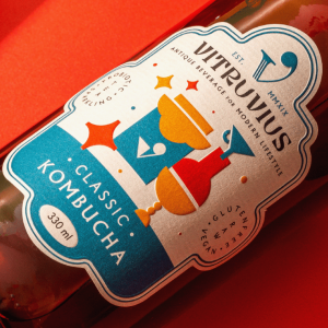
Simple shapes can be powerful communication tools for brands. 💡
Discover the art of simplicity embedded in sophistication with Vitruvius Kombucha’s packaging design. With a history rooted in hundreds of years of traditional taste, this ancient beverage for a modern lifestyle is brought to new heights with their innovative approach.
The minimalist shapes speak for themselves, telling the story of this beverage’s natural ingredients and philosophical origins. Simple forms are brought together to represent the powerful product ingredients. Bold colors accented with gold hint at the premium quality. 🍉
We think this delightful packaging is a work of art that will stand out on shelves. 💚
Read more: https://buff.ly/3SJHZ9k
