
The best brand stories breathe life into a design and create an emotional connection. 💕
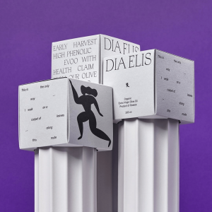
Dia Elis’ olives are grown and cold pressed into Extra Virgin Olive Oil at the site of the ancient Olympic Games in the Peloponnese region. The brand mirrors its ancient Greek heritage. The sophisticated packaging, designed by G Design Studio, is founded on Dia Elis’ handmade slender, fluted white ceramic bottles that mimic classic Greek columns. A square box at the top creates a classical Greek architectural look. 🏛️
The key graphic of the design is Dia Elis’ female athlete stride logo. The typography hints at vintage inspiration. The box features a slim serif font with poetry on one side and Dia Elis oil’s high phenolic content on the other.
We think the Dia Elis packaging represents sophistication and high quality. It also elegantly celebrates ancient priestesses and modern Olympic women.
Read more: https://buff.ly/3JrdiCT