
Color and typography choices are particularly important in accessible design – but this should not compromise elegance or style. 🎨
Instituto Mano Down is a non-profit organization that promotes autonomy and inclusion for people with and without disabilities. They point out that even for people with learning difficulties, childish design should be avoided.
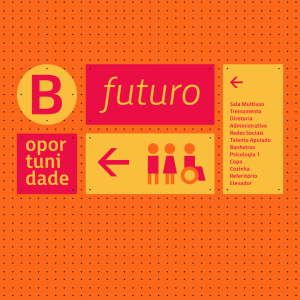
They recently launched a new design for accessible signage that is both functional and sustainable. Based on a grid, the signs are made of marine plywood modules that are held in place by pegs. Bright contrasting colors give the signage a stylish and modern look. A new font, FS Millbank, was created in accordance with the accessibility guidelines to provide clear and readable navigation information. ♿
We love the use of color and font to make this accessible signage stand out and think it benefits all. 💚
Read more: https://buff.ly/3Esyu7o