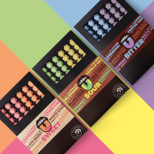
Chocolate is art. And for Friandries luxurious culinary chocolates, adventure. 🦄
Taking inspiration from the brand mandate of playing with different ingredients, colors, and taste, Van Heertum Design VHD was excited to design the packaging of a new range. The result – a mix of street art and modern craftsmanship.
The sour, sweet, and bitter taste of different flavor profiles led them to a graffiti-like mouth and tongue as the visual focus. The funky tongues are vibrant in a range of colors that differentiates the flavors as well. The use of a black box makes the colorful chocolates even more striking.🍫
We think this design creates a playful chocolate experience for adventurous chocolate lovers. 💚
Read more 👉: https://buff.ly/3rhtEUy
