Any designer will know that it is vital to carry out numerous prepress checks before sending your proof to the printer. We have curated this essential checklist from industry experts and team members who are print specialists with years of experience in perfecting print runs.
Following these steps will help avoid mistakes going to print. And mistakes can be costly.
This is one of the most comprehensive checklists you will find. It incorporates everything from simple content controls to advanced technical procedures.
Prepress Checklist
Colors
To ensure your brand maintains its professional image, you need to check that all colors and company logos are on-brand. These will typically be set up as spot colors or Pantones, to ensure that the color is the same regardless of the printer. Make sure that they are clearly and correctly named in the file as well as the slug area. This will make it easier for others to review too.
- Check that all colors are on-brand.
- Make sure any company logos are using the correct special/spot color as needed.
- Take care to remove any color duplication. For example PANTONE 300C, PANTONE 300 CVC.
- Include solid swatches of all colors used in the document inside the slug area (outside the trim area).
- Make sure the colors are listed in the slug area. Each color name needs to be printed using its own color CYAN, MAGENTA, YELLOW, BLACK.
- Remove unused colors, or colors that have been used in the slug area, but not actually in the finished product.
- Check that ‘rich’ black is only used where needed. Traditionally, ‘rich’ black is created by layering 100% key over 1 or more process colors – which causes the black to appear ‘blacker’. This should not be used in font under 10 points to avoid misregistration. Here use ‘standard’ black instead (100% K).
- Make sure there are no RGB elements, unless specifically agreed between you and the printer.
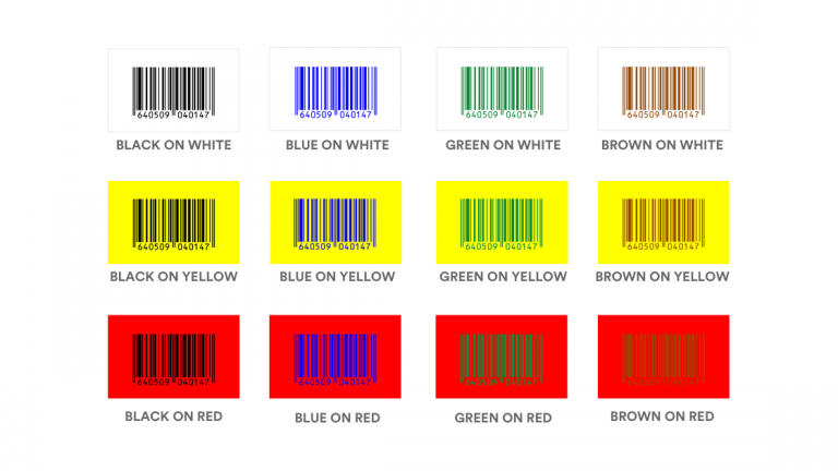
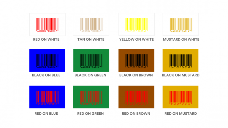
- Make sure barcodes are included in a color that can be used with a barcode reader.
Layout
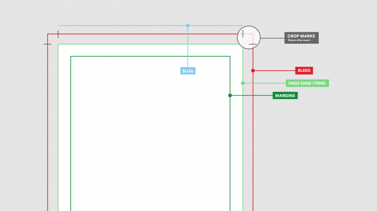
Designs must be placed correctly on a proof so that the printed work reflects the inspiration of the digital design. A variety of lines and marks indicate the edges of your design and where cuts should be made once things are printed. Crop marks indicate where your design will be cut, and the bleed is where parts of text or objects extend past the page boundary to compensate for accidental trimming of your artwork. A cutter or trimming guide is required when you’re looking to create a custom shape. It is basically a line around your design that serves two purposes – it tells the printer what shape you’re after, and where you want the shape to be cut on your design.
- Ensure adequate bleed has been applied.
- Folds to be indicated with dotted/dashed lines, and cuts to be indicated with a solid line.
- Is there a cutter/trimming guide? Your cutter guide should be a vector outline, and should ideally be supplied within your design file on a separate layer or as a PDF, EPS or AI (Adobe Illustrator) file.
- Ensure all guides are set to overprint (dielines, trimming, foil block, emboss etc.).
- Make sure any color bars that appear on the printed job, will be hidden in the finished product eg. on flaps, or glued edges.
- Clearly have the document name, version, and date created included on the PDF slug area.
Printer
Consult with your printer to understand any limits of their equipment. A test run for bigger jobs is also advisable, to avoid unnecessary reprint or wastage costs.
- Make sure the design of the artwork can be reasonably achieved on the output medium eg. no tight registration on screen printing jobs.
- Make sure you have checked with your printer and applied any required trapping to the document.
- Check your printer can use PDF files produced with your PDF settings. Try to use industry-standard settings, such as PDF X-3.
- Preflight your PDF file before submitting. Your printer should be able to supply you with an Acrobat PDF Preflight profile to be used for the preflight within Acrobat.
General
Even the smallest errors can have a major impact on your printed artwork. Here are some general tips that are a must before you go to print.
- Spell check the document and ensure grammar is correct.
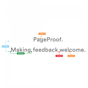
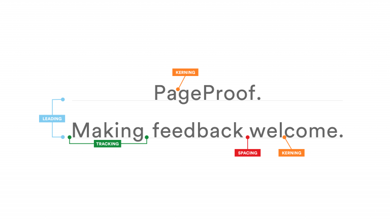
- Check fonts are as per your brand brand guidelines and text spacing, kerning, and tracking is correct.
- Check the text point size – make sure the text point size does not appear smaller than an agreed minimum point size.
- Make sure all fonts are fully embedded or embedded as a subset in case your printer does not have the same fonts.
- Ensure that image resolution is at least 300 PPI (pixels per inch) to avoid blurriness when printed.
- Wherever possible, use a vector version of any logos, trademarks, awards. Ideally, you should proof these separately.
- Make sure all line weights are an absolute value. No ‘hairline’ lines, as these are so fine they may not appear in the final printed piece.
- Ensure the units of measurements are clear (inches, centimeters, millimeters) and if possible, include a second variation eg: 12” (304.08mm).
- Clearly mark the size ratio if it is not 1:1.
PageProof offers endless features that will help ensure your file is pixel perfect before being sent to the printer.
Chat with our team to find out more.

