There is nothing better than a compelling brand story. So when we discovered the divine tale and design of 42 Dubonnet, we fell in love. 💚
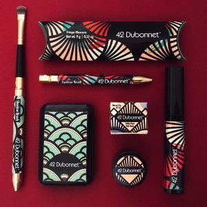
Crème de Mint’s vintage design for the cosmetics brand was inspired by an era full of mystery, allure, and glamour. The brand’s design was deeply rooted in the secrecy and roaring excitement of the 1920s.
42 Dubonnet is the address of an imaginary secret speakeasy. Dubonnet was a popular wine aperitif of the time. Interestingly, each of the lipsticks and lip glosses were named after a popular drink from the prohibition era. 💄
To reflect the mystery of the speakeasy, the cosmetic packaging was in black with vintage colors used as layers. The fan-shaped Art Deco pattern on the packaging reflects the glamour of the haute couture of the time.
42 Dubonnet’s packaging also emphasizes cruelty-free and giving back. If you look closely, you’ll see hidden scenes of wildlife from a large swamp as part of the packaging graphics, and each product category has a different animal hidden in the design. 42 Dubonnet’s commitment to wildlife conservation meant that part of its profits was donated to the Everglades Foundation. 🦎
We love how 42 Dubonnet celebrates the beauty of women with this 1920s-inspired design, as well as telling a story, founded on mystery and intrigue. 💚
Read more 👉: https://buff.ly/3vYjR8w
