
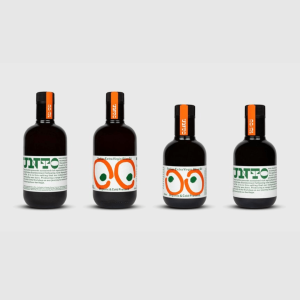
Localism is a continuing trend. Supporting this wholeheartedly, UNTO launched a range of premium olive oils with a focus on protecting the local ecology and breathing life back into the Tuscan valleys. 🫒
Studio Bergini created a set of bold graphic elements to reflect the unique, hands-on approach and stand out on shelves on a budget.
The playful design includes two olives surrounded by large oval patterns resembling a pair of watchful eyes. On the packaging, these are screen-printed with a layer of translucent ink. To reinforce the sense of local, crude typography was used overprinted onto spot colors. 👀
We think the creative is clever in both typography and the use of color, lending a sense of homemade at its core.💚 The judges from D&AD Awards 2022 also loved the design shortlisting it for Branding and New Branding Schemes 2022.
Read more 👉: https://buff.ly/3R857eW