
Did you know that there are approximately 284 million people with visual impairment worldwide 👀?
In the world of branding, every logo has a meaning. But people rarely know these meanings.
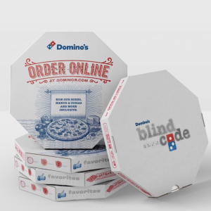
Domino’s was given the chance to redefine how its logo was perceived. The Pub School was inspired by the similarity of the Domino’s Pizza logo to the dots used in Braille code. The result was a 360 campaign called Domino’s “blind code”.
They created packaging, menus, and flyers in Braille code – supported by an online campaign. Enabling visually impaired people to identify the contents of the menu using Braille 🍕.
We love how this design turns the brand logo into a second language for the blind and gives the logo a powerful purpose💚.
Read more 👉: https://buff.ly/3yHEwQa